Short answer: good website design matters because buyers decide whether to trust you before they read much. A well-designed site makes it obvious who you help and what to do next, puts proof where decisions happen, loads fast on a phone and is easy for search engines and AI tools to understand. When those pieces are right, the same traffic produces more of the right inquiries.
Design is often treated as the look of a site: colors, fonts, photos. That matters, but it’s the smaller part. The bigger part is how the site is organized, what it says first, where it shows proof and how easy it makes the next step. This guide covers why that matters for a business, the characteristics that good websites share, and how to present your benefits so buyers actually notice them.
Why website design matters for a business
Credibility comes before the first sentence
Visitors form an impression in seconds, mostly from layout, clarity and polish. A dated or confusing site raises a quiet question: if this is how they present themselves, how do they run projects? A clean, current site doesn’t win the deal by itself, but it keeps you in the running.
Clear sites produce better inquiries
When a site states plainly who it serves and what it does, the wrong buyers leave and the right ones contact you with better questions. That saves sales time, and it’s one of the least visible benefits of good design.
Search engines and AI tools reward structure
Google, Bing and AI answer engines all need to work out what each page is about and how the pages relate. Clear page purposes, sensible headings, internal links and fast pages make that easier. A beautiful site with a muddled structure can be nearly invisible in search.
You get more from traffic you already have
Most businesses already pay for visitors through ads, SEO, trade shows or referrals. A site that converts a larger share of those visits lowers the cost of every lead, without buying more traffic.
What makes a good website: 9 characteristics
These are the attributes we look for when we review a site, whether it belongs to a contractor, a manufacturer or a healthcare organization.
1. It’s clear within five seconds
A first-time visitor should be able to answer three questions almost immediately: who is this for, what do they do, and what should I do next? If the homepage opens with a slogan that could belong to anyone, it fails this test.
2. It’s organized around how buyers look for you
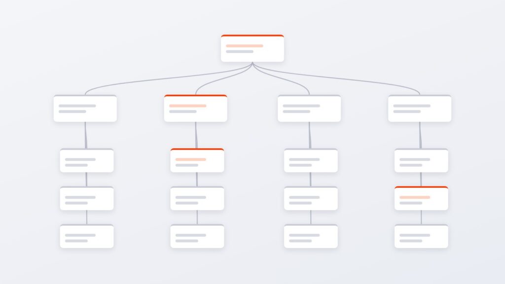
Buyers arrive with a question: do you serve my industry, do you offer this service, do you work in my area? Good navigation mirrors those questions. Service pages, industry pages and location pages each give one kind of buyer a clear path, instead of a single page trying to speak to everyone.
3. It shows proof where decisions happen
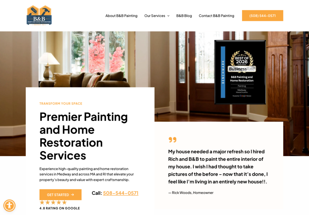
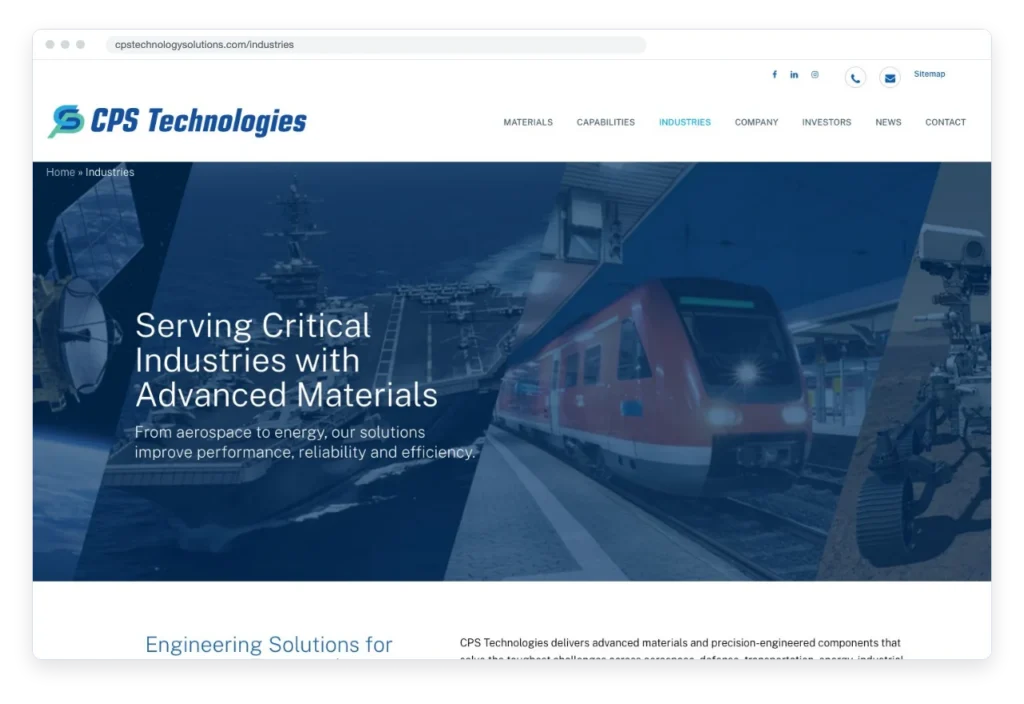
Case studies, client logos, reviews, certifications and photos of real work belong next to the claims they support, not on a single testimonials page nobody visits. Proof placed near a call to action does more work than proof buried at the bottom.
4. Every page has one obvious next step
A page with six buttons of equal weight asks the visitor to make a decision they didn’t come to make. Pick the primary action for each page, such as requesting a quote, booking a call or calling now, and make it stand out. Secondary options can be quieter.
5. It’s fast and stable
Slow pages lose visitors before they see anything, and layouts that jump around while loading feel broken. Speed is a design decision as much as a technical one: image sizes, fonts, scripts and plugins all add weight. Our WordPress performance guide covers what to fix first.
6. It works properly on a phone
For many businesses, most visitors are on mobile. Good mobile design means more than shrinking the desktop layout: tap targets are big enough, phone numbers are tappable, forms are short and the key message survives the smaller screen.
7. It’s accessible
Readable contrast, real headings, descriptive link text, alt text on meaningful images and forms that work with a keyboard help every visitor, including people using assistive technology. Accessibility is also a growing legal and procurement requirement. See our guide to website compliance and accessibility.
8. It’s easy to find in search and AI answers
Each important page targets one clear topic, uses descriptive titles and headings, and links to related pages. Structured data and a clear description of the business help search engines and AI tools understand who you are.
9. It’s easy to keep current
A site that only a developer can update goes stale. Good design includes a content system your team can use: reusable page sections, clear editing and a plan for who updates what. A site with current case studies and news looks like a company that’s active.
How to structure the benefits on your website
Most sites list features: what you do, what’s included, what equipment you use. Buyers are looking for outcomes. A simple structure helps each benefit land:
- Lead with the outcome. Say what changes for the buyer: fewer missed calls, faster quotes, less downtime, a site the team can update.
- Then explain how. One or two sentences on the feature or process that makes the outcome possible.
- Then show proof. A result, a client name, a photo of the work or a short quote.
- Keep one benefit per section. A wall of ten benefits in one paragraph reads as noise.
- Put benefits near the decision. The strongest benefit belongs next to the main call to action, not three scrolls away from it.
For example, “24/7 monitoring” is a feature. “Problems get caught before your customers notice” is the benefit. Pair it with a real example and it becomes believable.
Good design vs. decoration
Some common choices look polished but get in the way:
- Homepage sliders that hide the main message behind rotating images
- Generic stock or AI imagery where photos of real work, people or products would build trust
- Clever headlines that don’t say what you do
- Contact details hidden in the footer
- Long, unbroken paragraphs of company history before any mention of the buyer
Is your current design costing you leads?
If your traffic is steady but inquiries are thin, design and structure are usually part of the reason. Start with 7 signs your website is costing you customers, then read our complete guide to websites that convert. If you’re planning a new site, the website discovery process explains how we decide what to build before design starts.
Need a better website?
We design and build websites for growing businesses, with the structure, proof and speed described above. See our web design and development services, or start with a website refresh if your site needs fixes rather than a rebuild.